A high-converting landing page is more than a digital flyer—it’s a focused, persuasive tool built to drive action. When it’s done right, it becomes your most powerful sales asset.
But most landing pages fail. They confuse, distract, or overwhelm your visitor. A high-converting landing page does the opposite: it removes friction, clarifies the next step, and gives people a reason to act right now.
If your website isn’t converting, it might be trying to do too much. Here’s how to build one page that does one thing—exceptionally well.
Designing a High-Converting Landing Page Starts with One Goal
Every strong landing page begins with a single question:
What is the one action you want your visitor to take?
Not three. Not “Explore More.” Just one.
Whether it’s booking a call, claiming a lead magnet, or purchasing a low-ticket offer, the page exists to support that exact moment.
At Sharpen Brand, we specialize in narrowing the focus, removing distractions, and turning curiosity into conversions.
Need help designing yours? Call us at 561-556-5602.
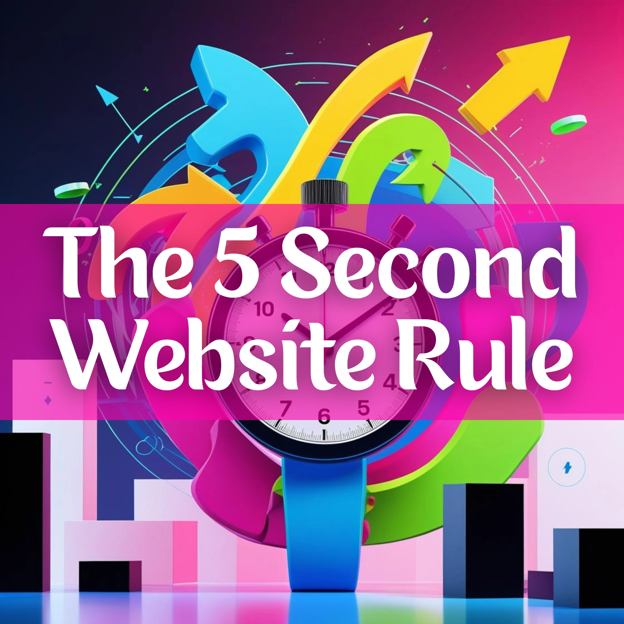
What Every High-Converting Landing Page Needs Above the Fold
The first five seconds matter. That means your above-the-fold space must answer:
- What’s the offer
- Who is it for
- What should they do next
Use:
- A clear, value-driven headline
- A subheading that clarifies or adds urgency
- One primary CTA with strong contrast
Use CTA copy that speaks directly to the result. Try “Let’s Fix Your Conversions” instead of “Submit.”
Add Stakes Without Adding Clutter
Visitors act when they feel urgency or emotional relevance. But don’t overdo it—clarity outperforms hype.
Use one or two lines under the hero section to highlight the cost of inaction. For example:
Still wondering if your page is performing? Most websites aren’t converting like they should. Let’s fix that.
Boost Credibility with Social Proof That Converts
Landing pages with social proof convert 34% better on average.
You don’t need much—just one:
- Solid client quote
- Logo grid
- Award or stat
Place another CTA after the proof section to catch action-ready visitors.
Use Layout That Guides the Scroll
A high-converting landing page design leads the eye. Here’s how:
- Ample white space
- Clear sections
- Bold font hierarchy
- Purposeful contrast and visual flow
When the layout breathes, your offer speaks clearly.
Repeat the Same CTA—Strategically
Conversion isn’t about giving more choices—it’s about reinforcing the right one.
Include your one CTA:
- At the top
- Mid-scroll
- At the bottom
All with identical language. All pointing to the same form or action.
Why Mobile Optimization Matters for Landing Page Conversions
If your landing page doesn’t perform on mobile, it doesn’t convert—period.
Mobile-first design ensures:
-
Finger-friendly buttons
-
Scalable, readable text
-
Fluid vertical scrolling and responsive stacking
Optimizing for mobile and using heatmaps, session recordings, and scroll analytics can significantly boost conversion rates by revealing issues you wouldn’t see otherwise
What to Leave Off Your Landing Page
Here’s what doesn’t belong:
- Navigation menus
- Blog posts
- Portfolio links
- Footer social icons
- Anything that takes visitors off the conversion path
A high-converting landing page is focused, fast, and friction-free.
The High-Converting Landing Page Checklist
- One goal
- Clear CTA
- Mobile-optimized
- Social proof
- Flow-focused layout
- Trust-building copy
- No distractions
Ready to Launch Your Own?
Call us at 561-556-5602
Or book your strategy call and let Sharpen Brand build the landing page your offer deserves.